

As a self-initiated concept, Here’s to Starbucks proposes a shift back toward emotional storytelling — away from product features and promotions, and toward the quiet, shared moments that have always defined the brand.
Vision
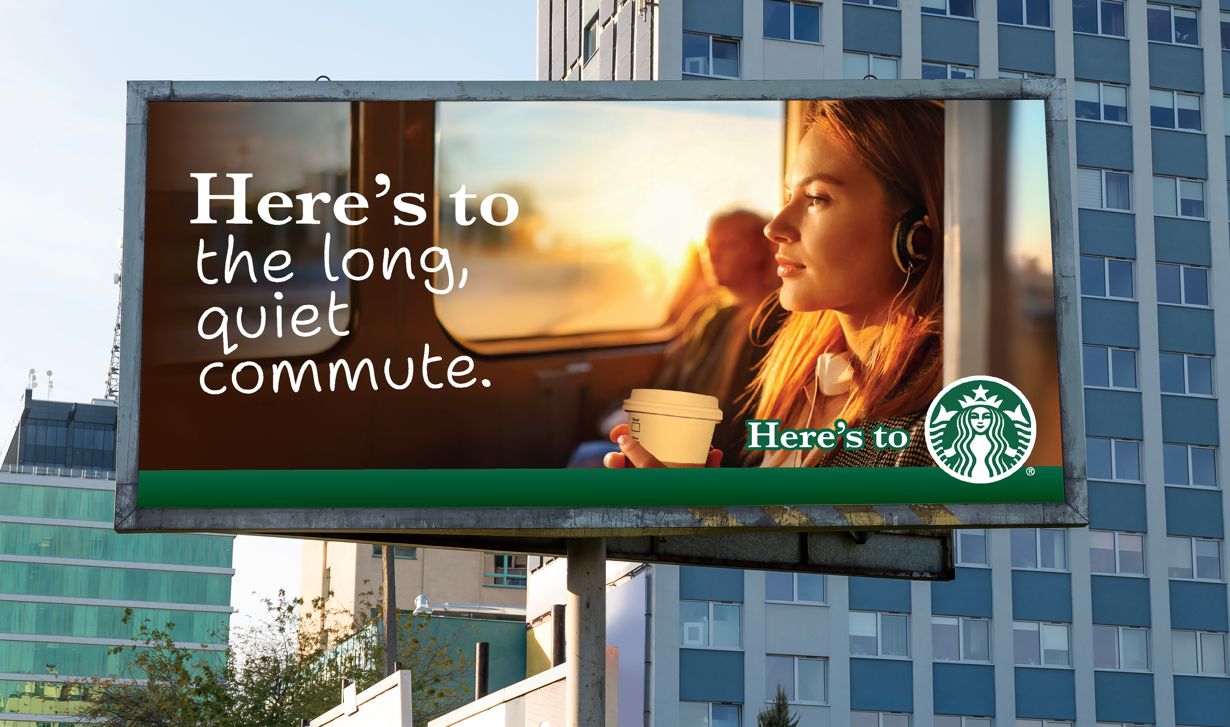
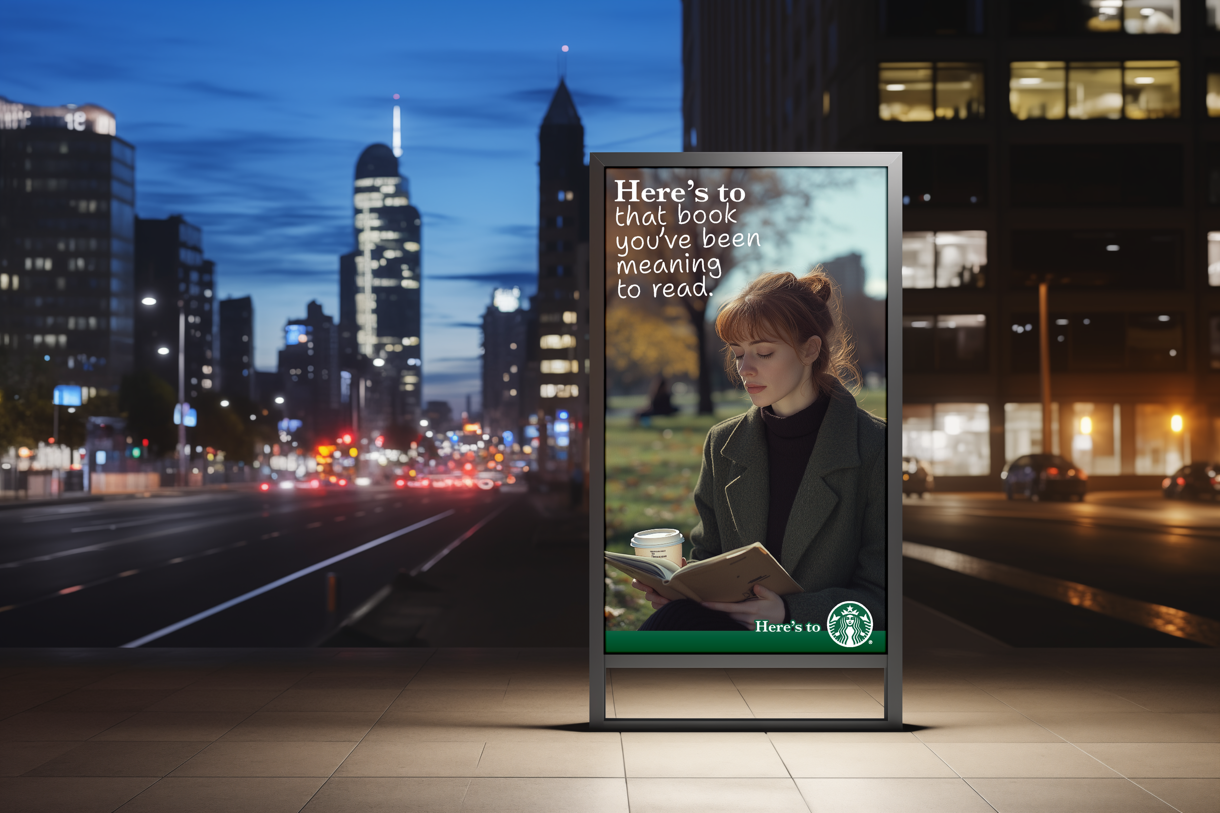
The campaign combines rich, cinematic imagery with handwritten typography — reminiscent of the names once scrawled across every cup.
Each visual carries a different “Here’s to…” phrase, bridging generations through tone and texture. The muted, warm color palette and soft light evoke a sense of familiarity and calm, creating a visual language that feels timeless and human.
Concept Design
Drawing from my own connection to the brand — from cold Chicago nights to early creative mornings — I built the campaign around a simple, human gesture: a toast.
The line “Here’s to Starbucks” anchors a series of visual stories that each capture a small, meaningful moment — “Here’s to late nights and early starts,” “Here’s to new cities and old friends.”
The idea reframes the logo on the cup as a shared symbol of comfort and belonging.
Approach
Challenge
Starbucks has become a fixture of everyday life — reliable, familiar, and everywhere. But in that ubiquity, the brand has lost some of the emotional storytelling that once made it feel personal. This concept explores how Starbucks could reconnect with its sentimental heritage and remind people why the ritual matters.
Starbucks — Spec Concept
A self-initiated concept celebrating Starbucks as a symbol of nostalgia and connection — a return to the brand’s roots in warmth, ritual, and shared experience.


“Here’s to Starbucks” — Nostalgia-Driven Brand Campaign